Monday, May 4, 2009

Proximity Hotel Tour

Visiting the Proximity Hotel in Greensboro, NC showed us all the options for "green lighting"


In the Banquet space the lights are dimmable to set the mood and the bulbs are easily changed to create different lighting effects.  This room also has windows almost all the way around so natural lighting is a key factor in lighting this space.

The Lounge area in the Hotel is amazing!  The huge windows allow tons of light to pour in, even on rainy days (like when we visited).  There are few lights that wash down the walls and columns.  And there are grids against the wall with LED fake candles flickering.  
The Lobby and reception desk is enhanced greatly by lighting accents.  The drapery behind the desk is washed with light.  This effect immediately allows the visitor to enjoy the relaxing environment.  All the lights in the hotel are controlled depending on the day (rainy, sunny, etc..) and the majority of them can be dimmed.

Light Series 5

this series we are to create three images of the same room displaying VALUE, SATURATION, AND HUE:

VALUE: for value I took different shades of burgundy to create this room.

SATURATION: I took blue and added shades of gray to it.  It makes the color more dull and the room more tranquil.
HUE: for hue I used contrasting colors, yellow and purple.  I also maintained this bright hue by adding bright red to the accents.


Thursday, March 19, 2009

More pictures to inspire...


Light Series 4

There are 6 types of lamps, for each one I will describe the following after finding an example:
a. purpose of the space
b. purpose of lighting
c. identify the lamp
d. describe the luminaire
e. effect of light source in space
f. effect of light source on materials
g. evaluate appropriateness of illumination level
h. based on observations and reflections provide recommendations for improvement.

1. DIRECT LIGHTING
example: My home kitchen
a. cooking
b. illuminate area for tasks such as cooking
c. recessed lighting
d. A bulb
e. Very adequate lighting on counter and space as a whole
f. materials are all neutral in color, light wood, and light grey marble for the counter tops.  There is some reflection in the countertops and hardware.
g. illumination level is very appropriate
h. I would probably add 2 more fixtures.

2. SEMI-DIRECT LIGHTING
example: hanging lights over bar area
a. drinking and eating
b. to highlight bar area
c. drop down spot lighting
d. MR16
e. claiming the spots to sit at bar area.  There are two seats and two drop down lights.  Illuminates seating area.
f. The reflection is off the counter tops as well as the glossy wooden chair and hardwood floor.
g. very appropriate and adequate.  Not too intense or dull.
h. None

3. GENERAL DIFFUSE LIGHTING
example: hanging down lamp in hallway
a. walking or passing through from room to room
b. illuminate walkway
c. hanging lamp
d. A Bulb
e. washing on walls, ceiling, and floor to illuminate all space.
f. no glare or reflections
g. very appropriate.  Not too intense or full, and just adequate lighting.
h. hang lamp a little higher

4. SEMI-INDIRECT LIGHTING
example: room 204
a. class room
b. illuminate work space
c. hanging lamp
d. T5 fluorescent
e. Lighting whole space while shades are drawn.  Lighting desks evenly (for the most part) throughout classroom
f. small reflections from desks and glare when overhead screen is down.
g. it is appropriate, but does not work very well
g. do not use fluorescent bulbs, also be able to turn some off while some stay on.

5. INDIRECT LIGHTING
example: above cabinet lighting
a. kitchen/cabinet: storage
b. "sparkle"
c. Rectangular (1 bulb) fluorescent
d. T5
e. illuminate cabinet top/decoration
f. impressive.  It adds to the decorative aspect or "sparkle" of the home.
g. very appropriate because it is not there for task lighting only decoration
h. none

6. DIRECT/INDIRECT LIGHTING
example: Target
a. Retail
b. illuminate merchandise and store
c. hanging fluorescent
d. T8 Fluorescent 
e. illuminating clothing, goods, walkways adequately and evenly.
f. reflecting off floor and some goods (depending on their material)
g. Too bright, however the intensity is welcoming at first and can energize you, I feel it is too bright though while you are shopping.
h. Perhaps use less bright bulbs or a different light all together - maybe recessed lighting.

Wednesday, March 18, 2009

Light Series 3

This series was to pick 4 fabrics (cool and warm colors) and observe them in different lighting condition in a residence, grocery store, retail store, and library.

This is the image of my 4 fabric samples in a residence space:  The lighting conditions were an overhead lamp/fan with 3 incandescent light bulbs.

This is the image of the 4 fabrics in a retail space.  There were overhead track lights in this area as the prominent light source, also throughout the space were fluorescent lights.

This is a photo of the fabrics in a library.  The light sources in this space were recessed fluorescent lighting fixtures.

This picture of the 4 fabrics is taken in a grocery store:  The lights are fluorescent lights and in some areas recessed fluorescent lights.


Monday, March 2, 2009

Daylight Model

This assignment was to create a space replicating the ideas Eero Saarinen displayed through the MIT chapel.  Below are images from the model we created and below that is an explanation  of the ways light is used in the MIT chapel.   The model we created was made to sit in  Greensboro NC in a flat area and is 20W x 30L x 15H.  We have designed it to be an intimate gathering are also.


Eero Saarinen (our chosen designer) and the MIT chapel in Cambridge MA.  Here are a few pictures of the chapel:
This is a metal structure hanging behind the pulpit that brings the light from the skylight down into the room.

[this is a close up image of the metal hanging structure behind the pulpit]


Wednesday, February 11, 2009

Light Series 2

Light Series 2 Assignment:
We have been assigned to visit an art museum, a restaurant, and a retail store.  We are to identify the lighting situation in each based on brightness, glare, type of lighting, patterns in shadow, etc.

The RESTAURANT I visited was the Cheesecake Factory in Charlotte NC.  While visiting I noticed the lighting in the space varies for what it is needed for.  There is drop down lighting over the tables, the bar, and the hostess desk.  There is also recessed lighting everywhere else.  I really have always enjoyed the lighting in this space.  The patterns along the tables and over the bar (made by the actual fixtures and/or reflections and shadows) are very soothing and gentle but enough to provide adequate lighting for the specific area. The lighting also keeps the restaurant unified with all the same glow.   
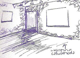
The ART MUSEUM I visited is called REDUX contemporary art center - it is a museum and a studio.  The illumination of this room I sketched as well as the others in the museum are lighted by track lighting hanging from above.  The actual walls of the museum do not go all the way to the ceiling, and the ceiling is painted black, to the lights hang to the height of the walls.  In this museum there is no glare, the brightness is very sufficient for the artwork.  The exhibit installation is not only artwork but the walls are painted according to the paintings on the wall.  I have no recommendations for glare or the brightness.  I think it was very easy to view all the artwork. 
There were some patterns of light falling on the wall because  track lights cast  round light spot on the wall (bright in the center and grows lighter as you get near the edge). The only problem with this was since the walls were painted as well as the art work the painting on the walls is not illuminated.  The artwork is the only thing illuminated but there are certain paintings within the wall.  I would suggest a more even lighting.

The RETAIL STORE I decided to explore is TRANQUILITIES on Spring Garden St.  This small store is full of stuff (candles, jewelery, home decor, etc).  The lighting bouces from one thing to another.  The main sources of lighting are lamps and small over head recessed lighting.  There are also small lights attached to shelves everywhere in the store, they are used to highlight items.  The store is lit brightly everywhere.  However, there was so much stuff the whole atmostphere was overwhelming and cluttered.  The majority of the light on the shelves were halogen, which was too bright and washed out the items.  I would recommend reducing the strength of the halogen lights or reduce the number of them.  There was also a lot of pattern created by the light themselves.  The bright lights scattered throughout drew your eye from one to the other, but kept you eye away from the items in the store.  The lighting however works because it is the same all throughout the store, and especially works in the jewelry section because the halogen lights up the jewels.